

Why Businesses are going for Responsive Website Design?
Very often, the question comes up about whether you should have two or three different websites (one for each type of device: mobile, tablet and desktop). Vdezine recommends that you have only one website that can adapt to all three. You have two options when considering how to go about building a mobile friendly website:
Responsive website design
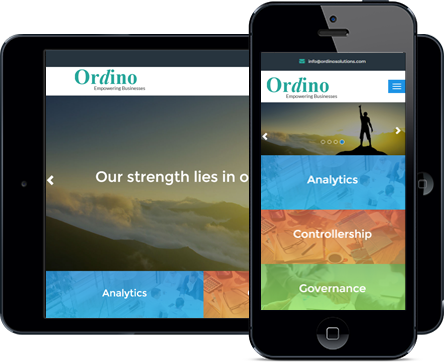
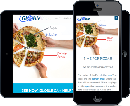
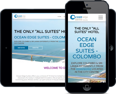
This is the preferred and ideal way of creating your website, where it adapts to any given screen resolution, be it a desktop, a laptop, wide screen monitors or small tablets and mobiles. The website can easily adapt itself to any of the screen size available and it is opened on. This option requires more upfront planning and technical codes than a typical website would, since website content elements must be considered and given priority as screen sizes shrink. Since early 2015, Responsive design websites are recommended by Google as the best for search engine optimization. In fact, Google has almost stopped ranking the websites which aren't mobile friendly and cannot be used by small devices.

Separate websites
The other way is to create one website for small devices (mobiles/tablets) and other one for desktops/laptops (includinmg wide screens). This options does work good in some cases but will ultimately fail in long term. Any change which has to be made in the website needs to be done twice and many a times the changes get missed in either of them. This leads to lack of consistent content across the websites. Some users of your website might miss the important content which needs to be equally shown to all website users. Alternatively, by providing a single, responsive version of your website to both desktop and mobile visitors, you make it easier for search engines to understand and serve your content.